iKern
In the previous chapter, we talked about a vocabulary when we said:
- rhythm and texture have to be designed.
- tightness, interpenetration and proximity are the tools.
- equilibrium has to be achieved.
What iKern allows is:
- To automatically impose equilibrium.
- To get a granular modulation and inherent coordination of tightness, interpenetration and proximity.
- To consequently design rhythm and texture.
iKern is a system to use a vocabulary in a meaningful way. To produce infinite different letter-fitting configurations, enabling efficient control of the output. And allowing to test and apply any possible strategy. Strategies become explicit in a process going from global to local.
iKern may seem to be roughly split into two subsystems: one trying to optimise legibility, the other trying to optimise readability. Let’s recall:
- Legibility means separation of shapes. So that glyphs remain recognisable. As a consequence, the white spaces have to keep the glyphs separated.
- Readability means equilibrium of shapes: every glyph has to appear centred in the middle of neighbouring glyphs. As a consequence, the white spaces have to seem homogeneous.
The first subsystem keeps the glyphs uniformly separated. It tries to prevent collisions in the first place. But since it has to, it tries to do it most regularly, finding a relative position between glyphs that could make them averagely and locally distant of a certain amount. This amount is the main parameter in iKern and it’s called Width. This subsystem is called the “proximity model”. Because it manages the way two glyphs stand near to each other.
After the proximity model, the second subsystem balances spaces to induce a perceived homogeneity of the white spaces between the glyphs. To create rhythm. As a complement to the proximity model, it has to consider the white space as a surface instead of focusing on internal distances, it has to impose a global behaviour instead of expressing a local one, it has to tackle the inherent non-uniformity of a medium impossible to be handled as geometric, it has to describe something happening inside the white space and not around. This subsystem is called the “air model”. Because the white space has to be adaptive, adjoining, but also measurable as a whole. For any possible shape, the air model has to calculate how much air there should be around a glyph, or between two glyphs, and how much two glyphs should/could move, or not, one relative to the other.
The proximity model describes a medium that acts like a non-linear elastic body subject to distortion. The air model describes a space whose inner fabric re-organises to counterbalance and adapt to the boundary conditions, eventually not keeping anymore uniform metric and isotropy.
It may seem like the two models describe different objects, but it’s not: they represent two faces of the same thing. As seen from the outside, exposing forces acting in the Euclidean uniform space: a distortion. As seen from the inside, exposing latent information in the non-uniformity of its fabric: a perturbation. Both manifestations are mostly oriented along with directions of minimum distance.
Those directions may be the same an ideal eye travels on from one glyph to another. Or maybe they comply with the natural tendency to follow minimum (resistance) paths. It’s not essential. Conjectures did not prompt this part of the theory. It emerged little by little, looking at numerical data provided by experiments, recognising patterns in them, selecting anything produced results, information and generalisation. The models came out in the form of reverse-engineering, or approximation, of the mental process of perceiving equilibrium, whatever it may be; not as models of the eye, but as models of the expectations of the eye. In this case, reverse-engineering meant grasping the white space’s potential structure as introspectively imagined and experienced.
At the core of the air model, there is the study of the perturbations in the white space. It consists of measuring local accumulations and decumulations, preferential directions, asymmetries in distribution, deviations, … anything that could detect a loss of uniformity. It consists in discovering seeds of internal organisation emerging from disuniformity. And, as the reading direction is horizontal, and so the direction of admissible displacements between glyphs, the study is mostly focused on internal events exposing vertical components, instead, or internal rotations, or labilities or instabilities, ... anything unable to express a collinear resolution and so revealing a sort of internal state.
This physical-like description is mostly post-conceptualisation, anyway. There should be equations in its place. Only mathematics is a language of objectivity: one can share something described in quantitative terms with others because placed on a symbolic layer that is not susceptible to subjective interpretation. But it’s not possible to do it. At least for the moment.
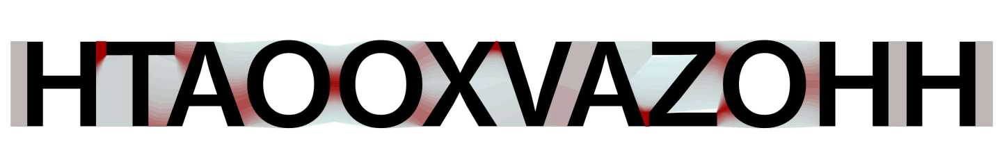
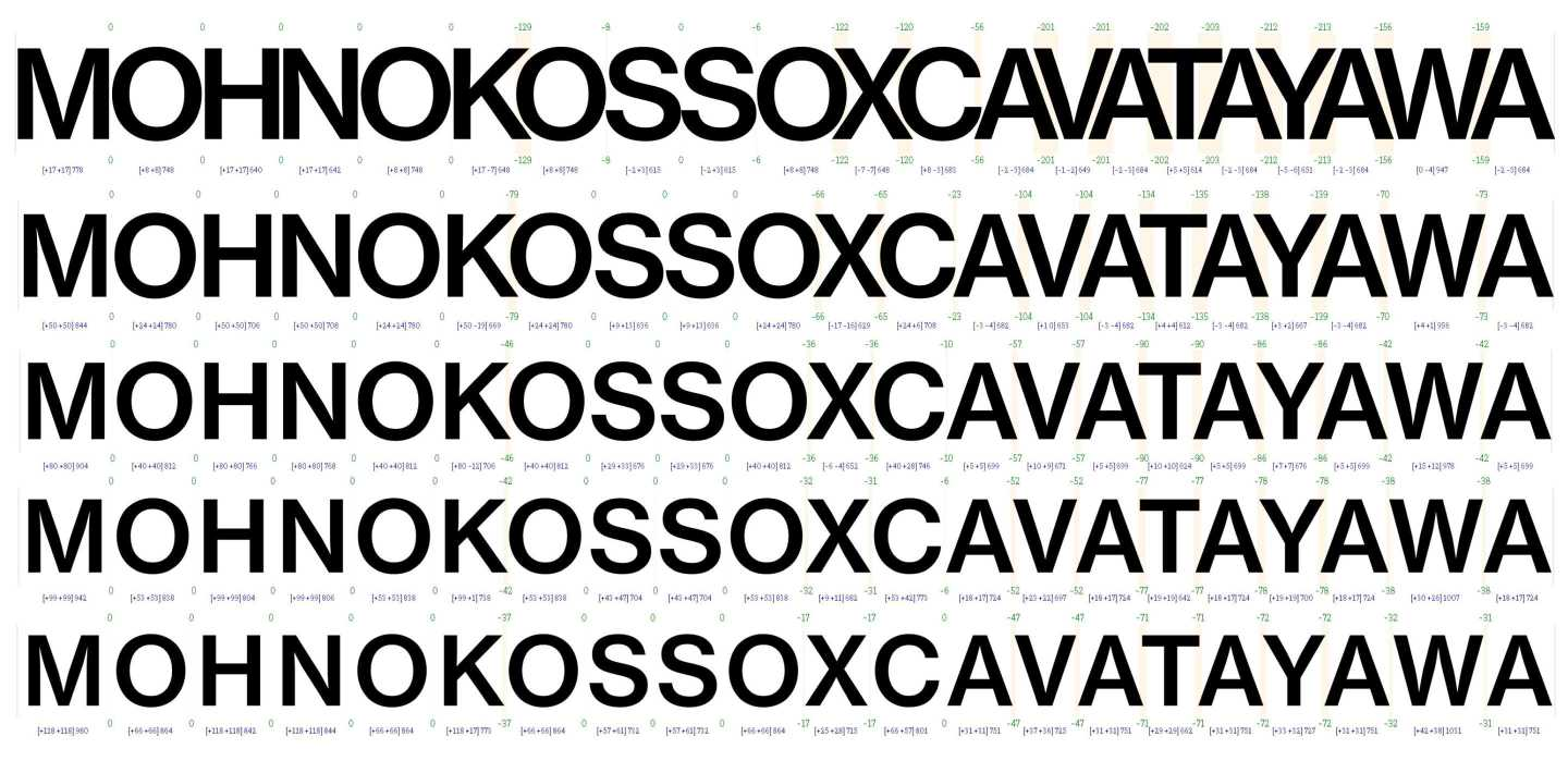
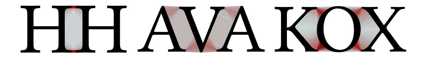
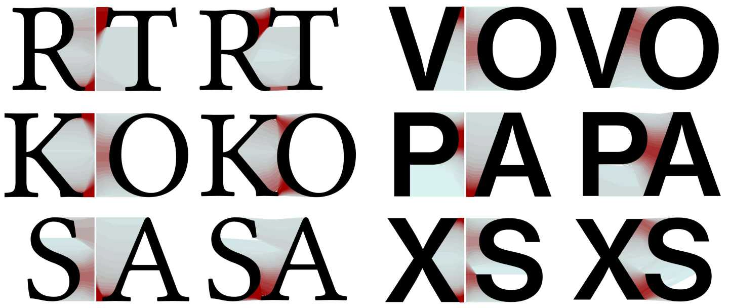
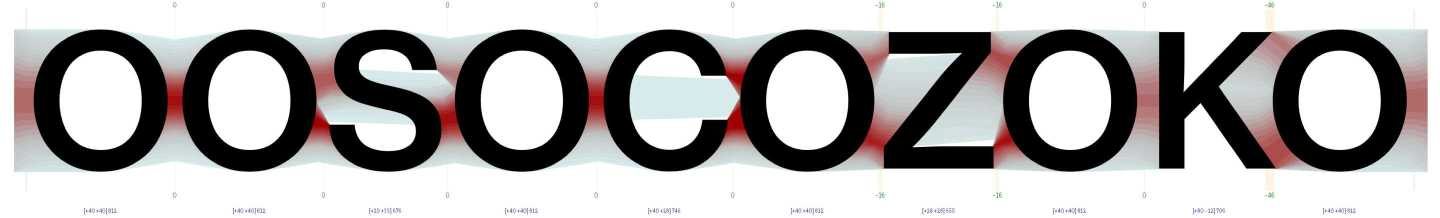
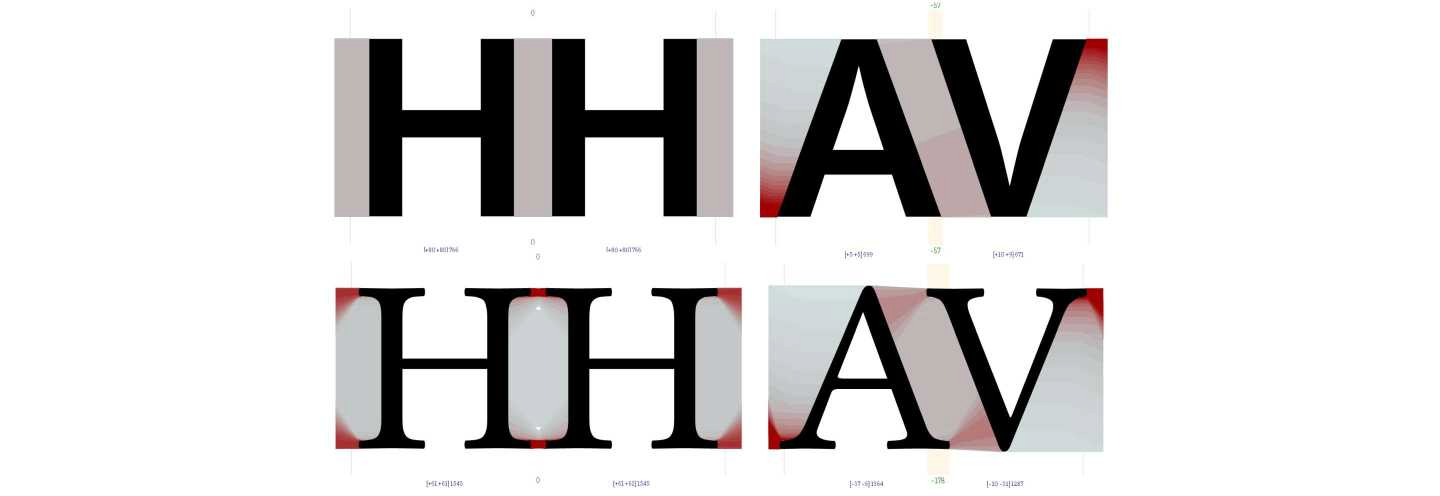
So it may help to visualise a space organised along the lines of minimum distance to grasp better the abstract description of the raw information iKern uses. Darker and red for the shorter lines, detectable by the gradient, that would mean compressed in the proximity model or dense in the air model; lighter and azure for the longer ones that would mean stretched or rarefied instead.
The need to make the Euclidean and distorted/perturbed modes compatible and coexistent in a single object, has led to the definition of a structure of the white space that embodies and conveys them both and that uses the map of their deviations to derive some of the properties and behaviours it exposes. Properties and behaviours represent how the white space translates its non-uniformity into entities describing it as a whole. Like building blocks, properties and behaviours are used for setting up mechanisms of interactions between glyphs of any shape. What’s more, loss of uniformity under perturbation may be correlated to a concept of density variation in the Euclidean space, contributing to the definition of a measurement system for a perceived (optical) space.
The inner structure of the white space also takes into account the level of tightness. The tighter the setting, in fact, the more the impact of the boundary outlines, for a simple matter of scale: the white space islands get relatively narrower and the perturbations amplified, the distortions increased. It contains more information, more compressed, than the one encoded on the glyph contours alone.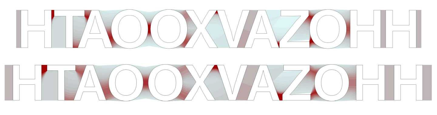 The proximity model tends to handle better a subset of shapes that are relatively common in all kinds of alphabets: convex shapes. These interact exclusively in a relatively narrow, tending to be centred, portion of the boundary outlines. In so setting an alignment in a context where glyphs can only move in one direction (usually horizontal). In an alphabet made of only convex glyphs, no one would try to invade the neighbouring areas. The air model could do little in these cases: it would try to act on the amount of air of mostly peripheral inert zones, thereby breaking the premise of having set an alignment, in the first place.

Convex shapes tend to interact by contact. As zero degree of any possible interaction. Especially, when not completely, ruled by the proximity model. Although sequences of convex shapes would not be regulated by an instance of rhythm, like the stem vertical elements, for example, and so theoretically breaking it, the resulting disposition gets accepted by the eye as fully natural anyway. Probably because it’s unavoidable. It’s a manifestation of the tolerance in perceiving equilibrium we have talked about in the previous chapters.
Alphabets tend to include non-convex shapes of any kind, anyway. As it’s functional to a differentiation in forms that facilitates glyph discrimination and recognition. Either because they’re open, when the white space enters the black part of the glyph, or vertically asymmetric, when the boundary outlines mainly protrude above or below, many of these shapes are prone to invade the surrounding area of neighbouring glyphs, especially convex ones, and to be invaded into their own. The farther the shapes move away from being convex-like, the more the proximity model alone would tend to create uneven white spaces with them. Because glyphs have to tend to interpenetrate one another as much as possible in a context ruled by local distances without a common strategy of perceptual homogeneity. A good foundation for a Tetris-like game, by the way.
It doesn’t mean that the proximity model is not fundamental in any case. It provides first-order handling of a potential interpenetration mechanism, offering useful tendency information and an indirect modulation ability by the width parameter: the narrower the width, the greater the interpenetration necessary to adapt to it. It’s useful in the perspective of a system willing to use a vocabulary, as we have seen.
As the width parameter happens to modulate both tightness and interpenetration, a twin parameter has been introduced that may act on tightness without altering interpenetration: tracking, a neutral and uniform modification of inter-distances. A combination of width and tracking allows decoupling tightness from interpenetration. Together they enable us to efficiently move on the micro-typographic space described in the previous chapter.
The balancing component of the air model adds or removes a certain amount of air around (non-convex) glyphs, or within certain combinations of glyphs, after the proximity model. The amount depends on the white space’s attitude to accept it, as a consequence of mechanisms, measured building a metric of the perceived (optical) space. The more the injected air, the more interactions between glyphs go from being ruled by contact, to being ruled by floating.
Pure floating happens when glyphs are averagely relatively distant from one another, when the white space’s predominant feature becomes its extension. A context which facilitates homogeneity, as we have seen, and favours the establishment of rhythm. In this case, glyphs interact with their whole boundary outlines, in a distributed or even peripheral way. The exact contrary of what happens to the convex ones. That’s why floating mostly happens in Sans typefaces: serifs or any other kind of protruding details tend to reduce the interaction’s uniform distribution, concentrating it on them. At the same time, serifs inherently impose a certain amount of air around glyphs just by contact.
Contact and floating are extremes in the range of all possible interaction ways. In general, the most happens in between: portions of glyphs can get near to each other, not enough to establish a contact, but enough to let the white space to re-organise, even if just partially, around them. These hybrid ways of interaction are perhaps the most complex because they describe a sort of phase transition. During interpenetration, the portions of space around two glyphs merge. They settle, also through reciprocal sliding movements, so that the resulting single space moves to a more neutral state. The white space relaxes. That’s the reason why the proximity and air models, with their mechanisms, get most of the information they use from the study of the distortions and perturbations in the white space: for the conceptual analogy between deformation and interpenetration. This study is the link between two very different models. What makes them a unitary system.
Opening and vertical asymmetry, in whichever combination, are the causes of interpenetration between glyphs, as we have seen. The distortions-perturbations in the white space they induce are of different optical valence. In more or less vertically symmetrical opening conformations, the space tends to accumulate on the contour parts most outstretched forward. The more the interaction remains horizontal and symmetric, the more the configuration gets stable. The more embedded portions remain excluded, the more the space gets dense. The level of openness rules the transition from convex to concave without excluding simultaneous occurrence.
In case of vertical asymmetry, instead, the space tends to accumulate the same, but in an eccentric and unstable way: we could imagine the triggering of a sort of rotation. The innermost and often wider portion of the white space has to get less dense to create an opposite action with the same lever arm to ensure stability (counter-rotation). Optically necessary because glyphs could not rotate but only translate. We could call this behaviour: bodiliness. As if the active and massive participation of the white space in a mechanism, could be the equivalent of the assertion: «the white space is part of a glyph.»
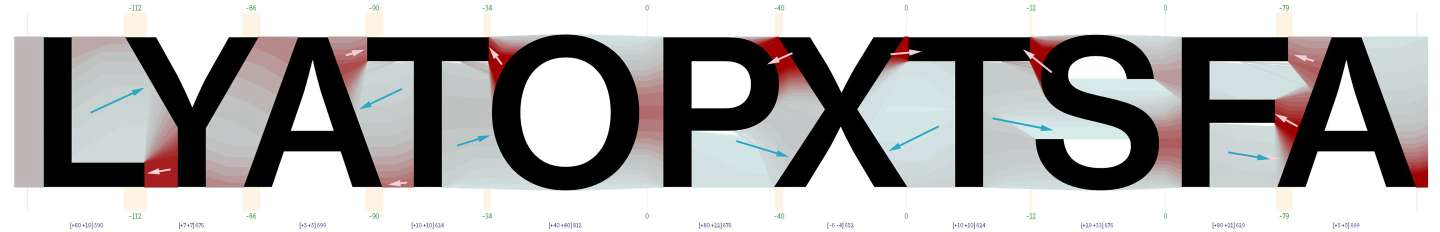
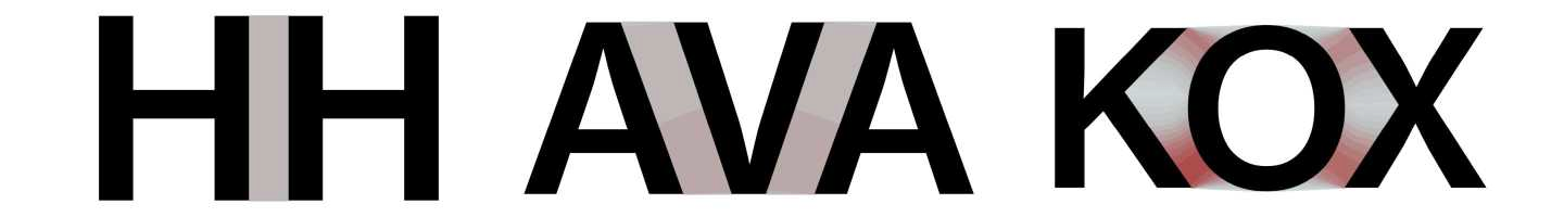
Minimum distortion-perturbation is somewhat frequent and surely a fundamental kind. It’s induced by tending to be rectilinear shapes, neither convex nor non-convex. With vertical direction (perpendicular to the reading direction) the space tends to remain unmodified and inert. It’s the stem element, so effective in establishing rhythm, as we have seen. With inclined directions, the space tends to become merely rotated. It’s the external diagonal element of so-called diagonal letters, like for A or V.
The arranged minimally distorted space tends to map the Euclidean space strictly: the optical space tends to coincide with the geometrical one. And it has to be handled as such. After the air model, the resulting space’s inherent uniformity means weakness of any imaginable internal mechanisms based on density. As if distortion acted like a potential so that its absence implies an indifference of equilibrium. Consequently allowing a certain freedom in setting the geometric amount of air.
It’s not a case that, as we know from letter-fitting practice, combinations involving stems and diagonals are strongly dependent on the context (placement on the micro-typographical space), on stylistic choices, personal preferences or conventions, like no others. Mechanisms based on geometry allow this discretionality.
What’s more, it’s often said that letter-fitting work could begin setting a sequence like HHOOHH. A sequence of stems and rounds. The former exhibiting indifference of equilibrium and so tending to be labile, according to the air model, the latter the most constrained in their consistency as prototypes of the convex forms, according to the proximity model. That’s the primordial experiment of how rhythm could be designed within the limits of the constraints.
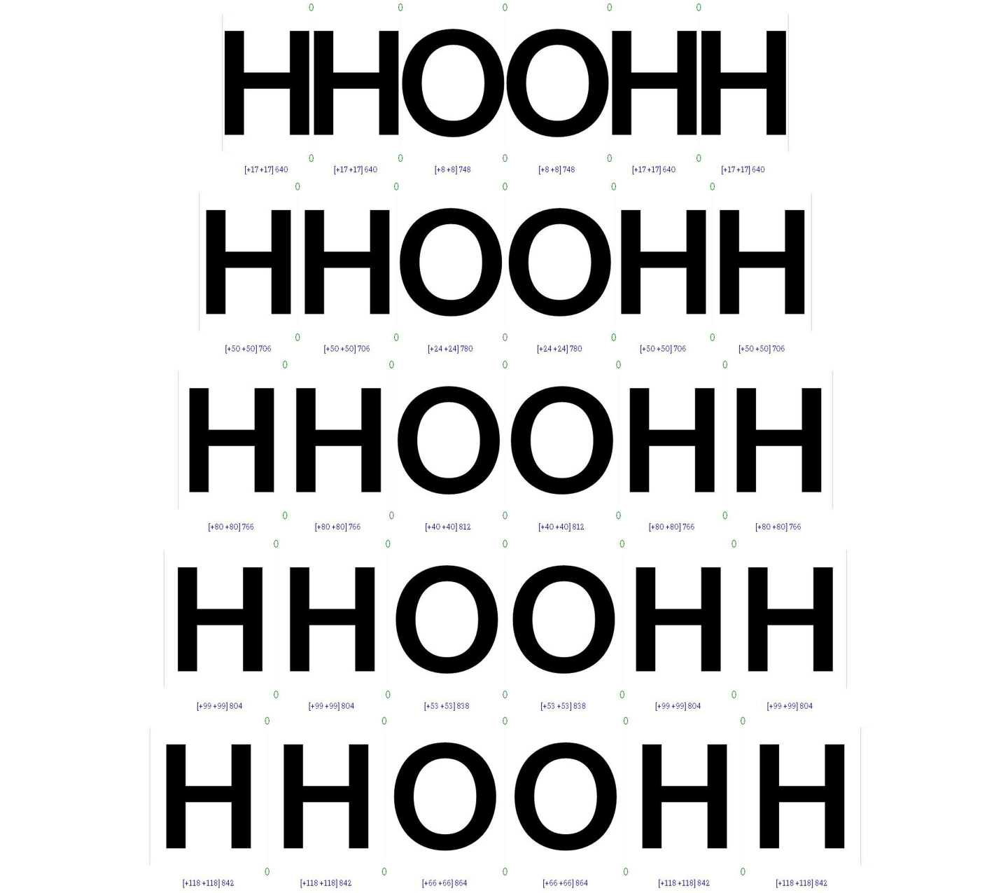
It’s another manifestation of the tolerance in perceiving equilibrium we have discussed before, as implemented in the model. In this case, it allows changing the aerial relation between stems and rounds (convex shapes), like it happens while setting the same typeface for Display or Text use, for example, always remaining inside a perceived acceptable range of balanced configurations. It lays the very conceptual foundations for a micro-typographic space to exist. It’s the degree of freedom that allows letter-fitting to happen in the first place.
Convexity, opening, asymmetry, bodiliness, density distributions, … form a set of properties that can help to create a classification of glyphs that is not arbitrary because directly derived from their shapes. Categories are fundamental in iKern because the algorithms are tuned to modulate their outputs or compute differently for specific classes surgically. Which increases the ability to better approximate the desired behaviour up to the slightest nuance. It’s a conceptual step beyond: it introduces a refining phase where iKern takes the raw information from the proximity and air models, and then translates it into typography.
It’s a conversion layer that has no specific collocation: it’s inside every single algorithm. It’s in the way the various algorithms perform different calculations, exchange values that can be inputs, properties, classifications, displacements or variables of any kind, always being mutually modulated and influenced. Forming a network. Interconnected to the point that it becomes impossible to separate spacing from kerning.
Algorithms are parametrically driven. It means experience is important too. In this case it's improved every day of working on all the different fonts coming from the service. It’s enhanced in a framework of theoretical knowledge and formalisation.